- Moms are multi-tasking at certain times of the day – "moms are so busy that they’re hopping online as they’re getting breakfast for the kids (the site shows a major spike in traffic at that time), during the early afternoon when kids are eating lunch/napping (another spike), or after bedtime."
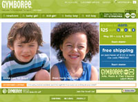
- Don’t ask too much, but do ask – Gymboree used a single question popup on their site asking "What one thing would you change on our Web site?" – sacrificing data collection for responses … and they got them.
- Popups do work (gasp!) – When [the Gymboree] team realized that Google wasn’t allowing ads linking to the home page due to the pop, they changed the offer to a banner-style ad on the site. "We definitely got more response when it was a popup," she said. "It didn’t bother people because it was just one question."
- Make the user experience faster – Probably a no-brainer, but they did pay attention to the tasks that were taking moms the longest (entering sizes, finding pieces to match outfits, etc.) and then made these easier. Lesson: it’s not just the shopping cart that you need to make easy to use.
- Listen to moms and let them contribute – Having an easy to find feedback link on each page titled "Gymboree Listens" has had a great effect on helping them to build a dialogue and community with their users. It’s the same principle iVillage, BabyCenter, and AllRecipes have built their sites on …
The article is available for open access at MarketingSherpa until June 10th – http://www.marketingsherpa.com/sample.cfm?contentID=2998


WE RECENTLY REMOVED COMMENTING - LEARN WHY HERE >