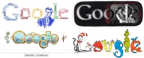
1. Be consistent, not paranoid.

While Google has been remarkably consistent with their logo, they also enjoy regularly playing with the logo in various ways to celebrate moments like Dr. Seuss' birthday or the first Indian movie with sound that arguably launched the Bollywood industry. The Doodle4Google project is another example, where a competition for schoolkids to create their own versions of the logo allows winners to be featured on the homepage for millions to see. The point this makes is that even with a consistent brand image, they are not afraid to venture outside of typical "brand guidelines." In many ways, allowing their logo to be "remixed" in various ways ADDS to their brand strength instead of diluting it.

Google's first stated mission has become almost legendary for its simplicity and non-corporate feeling … "don't be evil." An undeniable jab at the monopolistic Microsoft of the time when Google was first founded, this simple focus on sharing what they actually do through natural language has continued at Google. Despite yesterday's setback in their goal of digitizing every book ever published – Google has stayed true to their own mandate of "organizing the world's information." Even last week, when they launched the new Google for Nonprofits program, the topline message was clear: "You're changing the world. We want to help. No jargon or doublespeak – just clear understandable mission statements.
3. Reinforce the brand suite.

Google is a product company, and as such they develop new products all the time and famously offer their engineers and staffers enough free time as part of their roles to dream up the next big thing. When they do launch a new product, it typically has "Google" in front of it and a design that is recognizable and fits into their "suite" of products. As a result, users get the sense that all of these products are designed to work together and that there will be an advantage if you already use one to start using another. This is critical to get them to adopt using new products which may replace other tools they are used to using which are developed by other companies.
4. Don't rush to rebrand acquisitions.
Along their growth path, Google has invested in several big acquisitions. The largest three would surely be Blogger (a blogging platform), Picasa (a photo sharing platform) and YouTube. Each has retained their own branding and identity, and Google has resisted the temptation to rebrand each or bring them directly into the brand suite of Google. Making this choice allows them to maintain the relationships that people may be built up with each of those brands and offer new services or functionality that are complimentary to what people are already using – instead of being dictatorial about forcing users to use a new tool … Google can keep the goodwill and userbase of an acquisition in a way that most larger brands could not.
5. Be brutal about brand simplicity.

*Image Credit: "Don't Be Evil" Image from http://noranajohar.blogspot.com/2009_05_01_archive.html


WE RECENTLY REMOVED COMMENTING - LEARN WHY HERE >