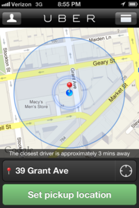
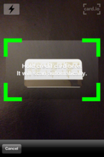
- Simplify mobile signups. I hardly ever sign up for any kind of service on my phone, because typing on a touch screen is such a pain. Unfortunately, when signing up for Uber, I was literally standing on a street corner and had no choice. The app seemed to be designed for exactly that. They only captured the most important and basic details, and let me take a photo of my credit card to scan in the number (instead of having to type it). Every app and signup process should do this one simple thing.
Add fun to necessary waiting. After I requested a pickup, the app confirmed that I had a driver … but it didn't stop there. As I was waiting, the app showed a Google map image of where I was and where my car was. Then I could track my car's progress in real time as it drove to meet me. Sure I was checking email and Twitter while waiting, but it was actually fun (yes fun!) to watch that car coming closer and closer until it arrived exactly as the map predicted. No empty hoping that every next car would be mine. The entire experience was stress free.
- Give people useful data they didn't ask for. After my trip, I received an email with my final total cost for the trip and a receipt. This was what I expected. What I didn't expect was that they also told me exactly how long my journey had taken, how many miles we traveled (which is how they calculate the fare) and what the average speed was that whole time. I definitely didn't need that information, but somehow I was still glad to have it.
- Make rating a two way street. When your journey finishes, you have the chance to rate your driver – which is nice. What you don't expect is that your driver also has a chance to rate you. So now karma has a real rating system, and it penalizes you for being an a-hole to your driver, if you happen to be that kind of person. That's how the world should work, and people should get rewarded or penalized for how they treat other people, so I love this. Not to mention that it finally gives drivers some way to be part of that rating conversation as well.
- Don't apologize for excluding some people. The app has been criticized for its focus on urban city dwellers and price point that makes it about 50% more expensive than taxis, if not more. But this criticism also means that they have a clear picture of who their target audience is … a consumer who doesn't mind paying more for the reliability and comfort of a clean black sedan that shows up exactly when you expect it.
All of these together make Uber probably my favourite new app … and marketing story to offer lessons to each of us no matter what we are trying to promote.





WE RECENTLY REMOVED COMMENTING - LEARN WHY HERE >