TurboTax is like the financial equivalent of anesthesia before a surgery … you know you are about to do something painful, but at least you can suffer a bit less. Yesterday was tax day in America, and for millions of users of the most popular tax software – it was a little easier to get this necessary chore out of the way thanks to TurboTax.
Aside from helping with taxes, though, the consistently optimized user interface offers plenty of interesting lessons for anyone who builds or manages their own online experience. Here are ten interesting lessons you can take and use from how TurboTax has built the user experience for their platform:
1. Feature A Real Person
Real people reassure us. They give us the sense that there is someone behind the experience that we are about to have and that we are not speaking to a faceless corporation. TurboTax uses real people at various points throughout the tax entry process to warn you about what is coming next, and remind you that help from a real person is always available through a phone call or online chat.
2. Clarify Your Language
One of the most common questions online forms ask is about your address. In this screen, TurboTax doesn’t ask for your mailing address or even your home address. Instead, they ask specifically “where do you recieve your mail?” By slightly rewording a common question, they make it a little clearer and easy to understand.
3. Make It Easy To Skip A Step
So often when going through an online process, we hit a stumbling block or a question we don’t have the answer to and then we get stuck. Imagine how many times that happens with tax preparation. Instead of forcing users to dig for the answer before moving on, they make it easy to skip a step – and even give you tips on what type of information you might need in order to find the right information to fill in when you do return to it later.
4. Find Out Why They Are Leaving
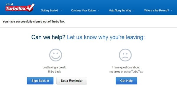
Knowing why people leave your site and giving them an option to come back is critical to keeping customers. It also helps you to demonstrate value and empathy for your users. With these two simple options, TurboTax reminds users that it has plenty of resources to help, no matter what your reason for leaving.
5. Change the Script To Empathize
Most companies have standard language that they use for standard processes, but sometimes you need to leave that behind in special situations. Early in the tax process, the TurboTax system asks you if the return is being prepared for someone who died during the 2012 year. If you check “yes,” the first thing they do is apologize for your loss. Then they promise to do their part by helping step through the tax return. We don’t expect a system or software to react to emotional loss. So when it does, it makes a small difference.
6. Ask questions that are easy to ignore.
Some of the questions during the process of doing taxes seem completely random. This one about being an inmate, for example, is probably unlikely to apply to most of the people doing their taxes. But it is also easy to ignore. The benefit is that TurboTax can still create a single process for nearly every type of situation, but make it easy for people to ignore the elements of it that don’t apply to them without getting confused.
7. Predict What Customers Need (And Share How You Did It)
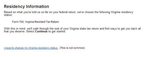
Plenty of information that users fill in during the process of filing taxes is information that can be used over again. One of the best features of TurboTax is the way that the software can import facts and figures – but the system also does a good job of not only telling you how the information was populated. As a result, you can make the choice for yourself if you want them to apply the importing feature, or not. That combined with the simple guidance that “this is not common” help users to understand what to choose when presented with sometimes challenging questions.
8. Give A Final Warning
Just to make sure you don’t accidentally submit your taxes – this screen comes up at the final stage of the tax preparation process. By comparing that moment when you press the green button to the in-person act of physically putting your tax return in the mailbox, you are reminded that once you submit, that is final. Leading up to this screen are several reminders that “you are not finished” until you actually reach this screen and press the green button.
9. Ask People To Share And Celebrate
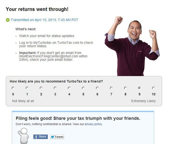
Finishing your taxes is a moment to celebrate, and aside from the visual of the random celebrating guy, TurboTax gives you a few final options. They ask for your feedback on the experience (using the “ultimate question” about likelihood to refer), and also give you the option to share your celebration of completing your taxes via social media, with the reassurance that no personal information is shared.
10. Incentivize the Feedback
One of the most important priorities for TurboTax after someone completes their taxes is to gather as much feedback as possible. This feedback is what helps the service improve year after year. The same is true for most businesses. The problem is, most of the time, users don’t readily take their own time to give this kind of feedback … unless they happen to be angry about something. As a final screen, TurboTax offers an incentive through a contest to invite people to share their feedback in exchange for a chance to win $100. Ultimately, the more feedback they gather, the more information they have to work with for the next year.


WE RECENTLY REMOVED COMMENTING - LEARN WHY HERE >