I have spent far too much of my life thinking about marketing.
It’s not a part of my brain that I can switch off. I see marketing choices in every interaction I have as a customer. I see brands in how people introduce themselves. I even see the branding in airport signs for the baggage claim.
I am clearly a guy that believes in the importance and power of building a great brand.
Or I thought I did … until I launched my own business.
How I Rediscovered The Value Of Branding …

I spent almost no time thinking about what to call my company. I put together a logo in an hour on Photoshop and started using a made up acronym (IMG) because my actual company name was too long. I got business cards printed.
And I realized when I actually became an entrepreneur that there might be some things more important than branding.
Like having a mission, for example. Or creating a great product. My new found perspective when it came to branding was something I even started to share on stage with other entrepreneurs. I had gone from giving branding advice, to now telling entrepreneurs not to over focus on branding.
Yet I had already begun to see what I was missing. Not having a strong brand was actually holding me back.
I was producing great content, winning new clients and speaking at lots of events, but my profile was getting lost. I wasn’t building the reputation I wanted. And people weren’t able to connect the dots between the many things I was doing.
I needed a brand strategy to pull it all together.
Phase 1 – The Planning …
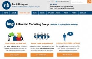
The old IMG website – now removed.
So for the past six months I have focused on developing a strategy for my own brand. I worked with my partners to tackle big questions that many entrepreneurs building a new business around themselves and their own skills are likely to face, such as (to name just a few):
- How can my personal brand and the brand of my company coexist?
- How can I describe what I do in a simple way?
- What services should I really be providing?
- What types of clients/customers should I be accepting?
- Can a single brand architecture really bring it all together?
Along the way to answering these questions, I spent thousands of dollars attending exclusive summits and educations gatherings of entrepreneurs and influencers. I developed a 50+ page brief of all the things I knew I had to fix or change – from broken URLs on my now defunct book website for my first book from back in 2008 to Slideshare presentations still branded from my old company. I looked at sites from other entrepreneurs and speakers that I loved and incorporated those into my brief.
Then I went out and hired a team of real design and creative professionals. The team involved a great designer (Barry Lai from Design Rehab), an amazing developer (Giovanni Filippi), a gifted video editor and animator and several other connections who assisted with editing, reviews and connections to make the site better. Ultimately my aim was to find amazing people, budget for paying them fairly, and avoid the common mistake of thinking I could do it all myself.
Phase 2 – The Redesign …
Once the team was in place, the first challenges of the redesign were to build a better information architecture to describe all the things that I did. Ultimately this translated into four specific focus areas:
- Marketing Advice and Consulting
- Training and Education
- Books and Publications
- Keynote Speaking
THE ICONS + COLOR PALETTE:
Each of these focus areas was represented by an icon and then a color palette was developed to represent them and also be applied across all branded communications materials:
After this color range was set – the next step was to develop a brand identity that could be applied both across all the personal work that I was doing as well as the work for the company IMG. This was perhaps the biggest part of our challenge – and one that we explored many different ways to solve.
THE REJECTED DESIGNS:
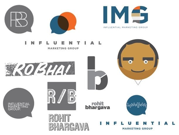
As with any creative exercise – you will end up with plenty of ideas that you just won’t end up using. Here are just a few of the designs we left behind in the process to land on a final brand.
THE FINAL DESIGN:
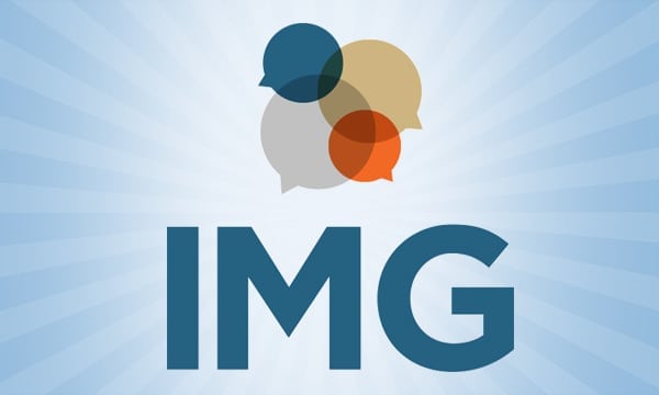
Ultimately – the colors and my affinity for the conversation bubbles with bold lettering led to the final designs for the new brand that would subtly incorporate the four focus areas and the range of colors into a recognizable icon paired with the strong letters of the acronym (instead of trying to squeeze the entire name of the company into a logo that looked good). Here are the final logos for the company and the personal brand:
WHAT DO YOU THINK OF THE NEW IMG SITE? COMMENT HERE >
Phase 3 – The Rollout …
My new Twitter LEGO guy!
Once the brand was developed, it was time to apply it across everything that I was doing. The easy part was developing a new template for written documents like presentations and proposals. Those were the first place I started to use the brand. The second was to use the brand across a new business card and get that printed – which I quickly did as well. Then came the hard part. I had to now update everything that I had published online and all the projects I was working on and think through how to apply this brand to everything. This meant updating social media profiles, changing old published documents and having this new look applied to everything.
THE INFLUENTIAL MARKETER LEARNING SERIES:
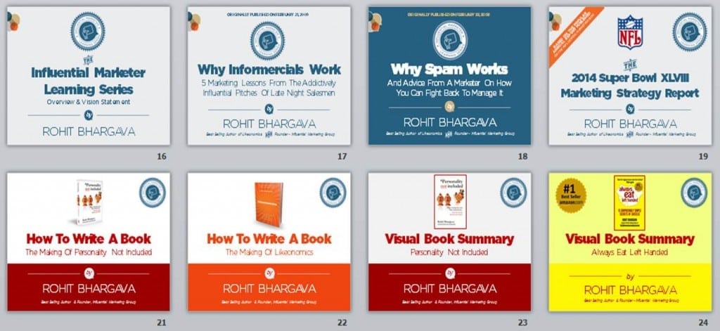
So with help from my virtual assistant, we started by rebranding all the presentations:
As part of this – I worked on launching new learning brand that I could apply across all the in person workshops, virtual training, and online ebooks and white papers that I was producing. This learning brand is called the “Influential Marketer Learning Series.”
THE WORKSHOPS:
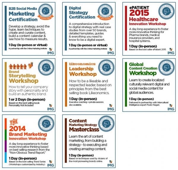
As my team was working on the assets and applying this design across my site to relaunch (a time consuming activity) – I needed to keep running my business and one of the most popular services was rapidly becoming my series of customized brand workshops on a range of topics. To apply the brand to these, I developed a series of short visual descriptions for the workshops that could be used online as well as in printed materials. Each built on the overall brand of the Influential Marketer Learning Series while also presenting the workshops as a concrete product and way that brands and organizations would work directly with IMG:
THE WEBSITE REDESIGN:
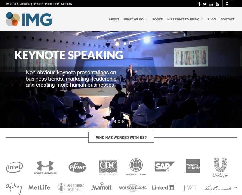
While working on the documents – my partners were hard at work on rebranding the website. The new color palette and fonts were being applied across the website and blog. My new site was being built on a new ecommerce friendly template that would allow for later customization and the addition of an online store directly on my site. In addition – the site had a new information architecture that would make content easier to find and reduce the number of options from what I previously had.
WHAT DO YOU THINK OF THE NEW IMG SITE? COMMENT HERE >
THE INFLUENTIAL MARKETING BLOG REDESIGN:
My blog just passed its ten year anniversary and so as part of relaunching the site, I had a chance to finally rethink some of the longstanding choices I had made. If you have been a consistent reader of the Influential Marketing Blog or even if you are knew, you might be interested to know what I specifically changed in this new design:
- Commenting Removed – I have been thinking of removing comments for quite some time and finally was able to take the plunge and get it done with this new site design. Aside from my continual frustration with conversational plugins like Disqus – I realized that the nature of the way people comment has changed dramatically as it now happens far more frequently on social media platforms rather than my blog itself. For more on why I removed commenting – you can read my update here.
- Categories Simplified – I had dozens of categories on my previous site, and though that level of detail has some value, I also wanted the content to be easier to navigate – so on the new blog you will see that there are seven “Featured Categories” on the blog: Brand Humanity, Content Marketing, Influence & Behaviour, Marketing Strategy, Small Business & Entrepreneurs, Social Media, Trends & Culture. This list was developed based on my writing interests, as well as the analytics on my most popular categories.
- Interactions Quantified – Instead of comments, I wanted to aggregate all the social interactions a given post was getting through multiple platforms. Focusing on the three moment often used, the team I used built a special aggregator to put all these comments together into a single number for “Interactions” that aims to illustrate how much traction through conversation or sharing a particular article is getting.
- Engage First Time Visitors – For years I have thought about adding a better way to engage first time visitors to my site – and finally added a feature at the top of my blog to help do that directly. You can read my introduction for first time visitors here >
THE YOUTUBE CHANNEL REDESIGN:
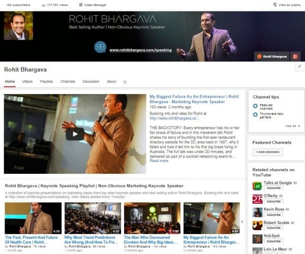
Since focusing on building more keynote speaking opportunities was a major goal of this new design, I also needed a way to apply the brand across a smarter strategy for using video. Once I had the new brand, I worked to apply it across a new and more robust YouTube Channel that had playlists, a more branded look, and more videos to feature my speaking:
Aside from branding the channel, here is an example of just one of the videos that we added there, along with the introductory animation:
Final Lessons:
All of this brings us up to this past week – when I aimed to finally and quietly launch the new site and work out some final kinks and issues before officially announcing and sharing it through this article. Through the journey, I learned several things about the process of branding that hopefully may have value for anyone facing a similar situation of rebranding themselves or their organization:
- Get Professional Help – The #1 thing I would recommend from this experience is making sure you work with people who know what they are doing. I am always tempted to dig into the WordPress code or fire up Photoshop, but it makes a difference to get in real pros who know how to work fast and effectively and then rely on their expertise. It is worth paying for.
- Double Your Timeline – The irony of every marketing agency I have ever worked at is that internal sites are often lowest priority and therefore take the longest. This site was no exception, as my travel and speaking schedule, the summer and plenty of other commitments often pushed the timeline for launching this site further and further back. We started the process in February – and finally launched in September (about 7 months later).
- Follow Your Own Advice – As someone who has advised brands on probably hundreds of website and landing pages over the past 15 years, there are lots of “best practices” that I know but fail to incorporate into my site. This redesign aims to correct many of those – including injecting far more personality into the site through my “Rather Reasonable Policies” as well as my “Cauliflower Confession.”
And now that you have read the full story behind launching my new brand as well as some candid lessons I learned in the process, I would absolutely love to hear any thoughts you have about the new site or suggestions for improving it! Feel free to email me directly at rohit@trustimg.com or send me a tweet @rohitbhargava. Or just use the link below …
WHAT DO YOU THINK OF THE NEW IMG SITE? COMMENT HERE >







WE RECENTLY REMOVED COMMENTING - LEARN WHY HERE >