The first time I saw Izzy, I knew he was a mistake.
I was living in Atlanta and it was sometime before the 1996 Olympic Games. I hadn’t even graduated from college or taken any of my marketing classes … but I had a gut reaction that the mascot officially named “Whatizit” and nicknamed Izzy was a disaster. Most people agreed. Years later, it remains one of the most widely ridiculed examples of Olympic branding from any of the Summer Games.
That summer in Atlanta jump started my lifelong love affair with the Olympics. I have since been to four more (Sydney, Beijing, London and Rio) and before the Tokyo games were postponed, I had planned on being there too. We still have our tickets and our fingers crossed that it happens in 2021.
Across the time, I’ve seen several patterns emerge that are the same no matter where the Olympics happen to be held. Everyone in the host city panics about the traffic … and it turns out to be fine. Every visitor panics about the crowds … and the chaos turns out to be well-managed. Every sponsor panics about their visibility … and it is always off the charts. The beautiful thing about the Olympics is that, unlike politics or companies, the Olympics have deep institutional knowledge.
In other words, people who work on an Olympics tend to come back and do it over and over. And they bring their experience with them.
Sadly, this doesn’t seem to happen with Olympic branding – which is probably why just about every past Olympic logo has sparked some kind of controversy. The London Olympic logo was widely hated for it’s odd shape and vague similarity to a popular animated character performing a lewd act. No one saw the hidden date of 2012 inside the logo or understood what connection the entire thing had to the city of London or more broadly to the culture of the United Kingdom.
Both the Rio and Tokyo logos were accused of plagiarism.
Even the recently released logo for the 2024 Paris Olympics had its share of critics who suggested the new logo reminded them of Jennifer Aniston’s character’s haircut from the TV show Friends:
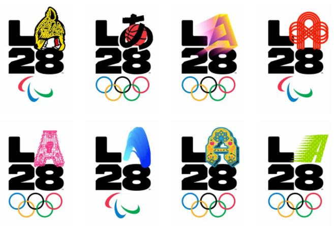
The reaction to LA’s first logo unveiling is different. People actually like it. What was the difference? The biggest shift was how the logo actually involved many different parts of LA’s creator communities and allowed them each to offer their own unique takes on the “A” of LA.
More than 20 people were asked to bring their personal stories to life through the letter “A” in the logo and participants included actress Reese Witherspoon, musician Billie Eilish, comedian Lilly Singh, tattoo artist Dr. Woo and pro soccer star Alex Morgan. As LA28 chairman Casey Wasserman told Taxi, “LA defies a singular identity. The LA28 Games will showcase our community’s collective creativity and celebrate the diversity that makes us strong.”
LA28 chief marketing officer Amy Gleeson continued, saying “No one mark could ever express all that Los Angeles and the Games represent. The best way to showcase the LA28 Games is by asking the community to share in the creation.”
The entire launch was clever, unifying, inclusive and exactly what the Olympics should be … a moment when people can feel included, uplifted and optimistic. It’s still eight long years to go until the Games come to LA, but at least they aren’t making the same mistakes as their predecessors right out of the gate.
As a brand marketer, storyteller and lover of the Olympics – it’s a fascinating and sadly rare example of how the best way to avoid a backlash is by actually involving your community instead of designing behind closed doors.
#olympics #la2028 #la28 #summergames #summerolympics


WE RECENTLY REMOVED COMMENTING - LEARN WHY HERE >